Designing modern, depth-rich user interfaces is an art form. One of the most critical tools in a web designer’s arsenal for achieving this depth is the shadow. However, writing complex shadow syntax by hand can be tedious and prone to errors. That is exactly why we built this CSS box shadow generator. Whether you are a seasoned developer looking to speed up your workflow or a beginner trying to understand how digital lighting works, this tool is designed for you.
A good CSS box shadow generator does more than just spit out code; it gives you immediate visual feedback. Instead of saving your file and refreshing your browser twenty times to get that “soft card” look just right, you can tweak sliders and see the result instantly right here.
Why Use a CSS Box Shadow Generator?
In the early days of the web, designs were flat—and not in the trendy “Flat Design” way, but in a boring, two-dimensional way. Today, design languages like Material Design and Neumorphism rely heavily on light and shadow to tell the user which elements are interactive, which are lifted, and which are recessed.
Writing the code manually looks something like this:
.my-element {
    box-shadow: 10px 10px 5px 0px rgba(0,0,0,0.75);
}
While that looks simple, it gets complicated quickly. What if you want multiple layers to create a hyper-realistic shadow? What if you need to convert hex colors to RGBA for transparency? Doing this mental math is inefficient. Our CSS box shadow generator handles the complex math and syntax generation for you, letting you focus purely on the aesthetics.
Understanding Box Shadow Properties
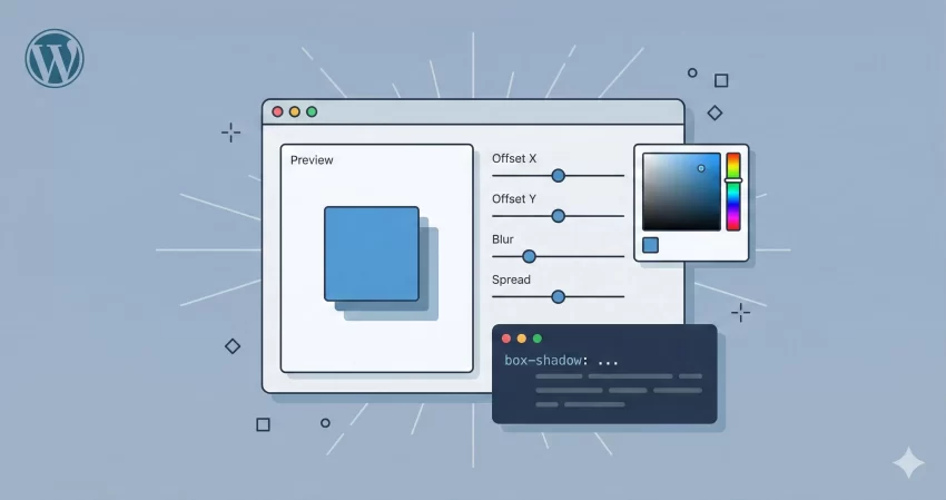
Before you dive into the sliders, it helps to understand what variables our CSS box shadow generator is actually manipulating. The standard box-shadow CSS syntax follows this order:
/* offset-x | offset-y | blur-radius | spread-radius | color */
box-shadow: 10px 5px 5px 0px black;
- Offset X (Horizontal): This determines how far the shadow moves left or right. A positive value moves it right; a negative value moves it left.
- Offset Y (Vertical): This pushes the shadow up or down. Most natural light comes from above, so you will often see positive Y values in this CSS box shadow generator.
- Blur Radius: This controls how sharp or soft the shadow is. A value of 0 is a sharp, solid shape. High values create a soft, dispersed “cloud” of shadow.
- Spread Radius: This creates the effect of the element being larger or smaller. Positive values expand the shadow, while negative values shrink it.
- Inset: This switch flips the shadow to the inside of the box, creating a recessed look, often used for input fields or pressed buttons.
How to Use This Tool
We have designed this CSS box shadow generator to be as intuitive as possible. Here is a quick guide to getting the most out of it:
1. Add and Adjust Layers
Modern shadows rarely consist of just one layer. Click the “+ Add Layer” button to stack multiple shadows. This is the secret to “smooth” shadows often seen on sites like Stripe or Apple. You can adjust the X/Y offsets and blur for each layer independently within the generator.
2. Fine-Tune Color and Opacity
Never use pitch black (#000000) at 100% opacity unless you are going for a specific brutalist style. Real shadows are subtle. Use the color picker to choose a dark shade (like a dark blue or grey) and use the opacity slider to bring it down to 10-20%. Our CSS box shadow generator automatically converts your selection into RGBA format.
3. Use Presets
In a rush? We have included presets for popular styles. Click “Soft Card” for a standard UI look, or “Long Shadow” for that trendy, diagonal graphic design effect. The tool will instantly populate the settings for you.
4. Copy and Paste
Once you are happy with the preview, look at the code block at the bottom. Click the box to instantly copy the CSS to your clipboard. The CSS box shadow generator provides the standard syntax along with -webkit and -moz prefixes to ensure maximum browser compatibility.
Privacy and Performance
Performance is a top priority for us. Unlike many other tools that process data on a server, this CSS box shadow generator runs entirely in your browser using JavaScript. This means two things:
- Zero Latency: The preview updates instantly as you drag the sliders. There is no server lag.
- 100% Privacy: We do not store your design choices. The code is generated on your machine, for your machine.
Frequently Asked Questions (FAQs)
Does this CSS box shadow generator support cross-browser compatibility?
Yes. The output code includes the standard box-shadow property as well as vendor prefixes for WebKit (Chrome, Safari) and Mozilla (Firefox) to ensure your design looks consistent across all browsers.
Can I create “Neumorphism” effects with this tool?
Absolutely. Neumorphism relies on two shadow layers: one light shadow (top-left) and one dark shadow (bottom-right). You can easily add two layers in our CSS box shadow generator to replicate this soft plastic look.
What is the difference between “Blur” and “Spread”?
Blur makes the edge of the shadow fade out. Spread actually changes the size of the shadow footprint. If you set Spread to 10px, the shadow will be 10px larger than the element on all sides before it even starts to blur.
Why is the “Inset” option useful?
The “Inset” option renders the shadow inside the border of the element. This is incredibly useful for creating text inputs, active states for buttons, or creating a sense of depth where an element looks “carved out” of the page.
We hope this CSS box shadow generator helps streamline your design process. Bookmark this page so you always have a quick way to generate complex CSS without the headache of manual coding.
Tip: Check our free CSS Gradient Generator tool.