Navigation is the lifeline of any website. If your visitors cannot find what they are looking for within seconds, they are likely to bounce faster than you can say “conversion.” One of the most effective ways to keep your navigation accessible at all times is by implementing a sticky header in WordPress. Whether you are running a high-traffic e-commerce store or a personal blog, ensuring your menu travels with the user as they scroll down is a massive upgrade to User Experience (UX).
In this comprehensive guide, we will explore exactly how to achieve this effect. We will break down the two primary methods: the manual “developer” route using CSS and JavaScript (perfect for control freaks like us), and the “plugin” route for those who prefer a no-code solution. By the end of this tutorial, you will have a sleek, professional header that sticks to the top of the viewport, ensuring your users never get lost.
Why You Need a Sticky Header in WordPress
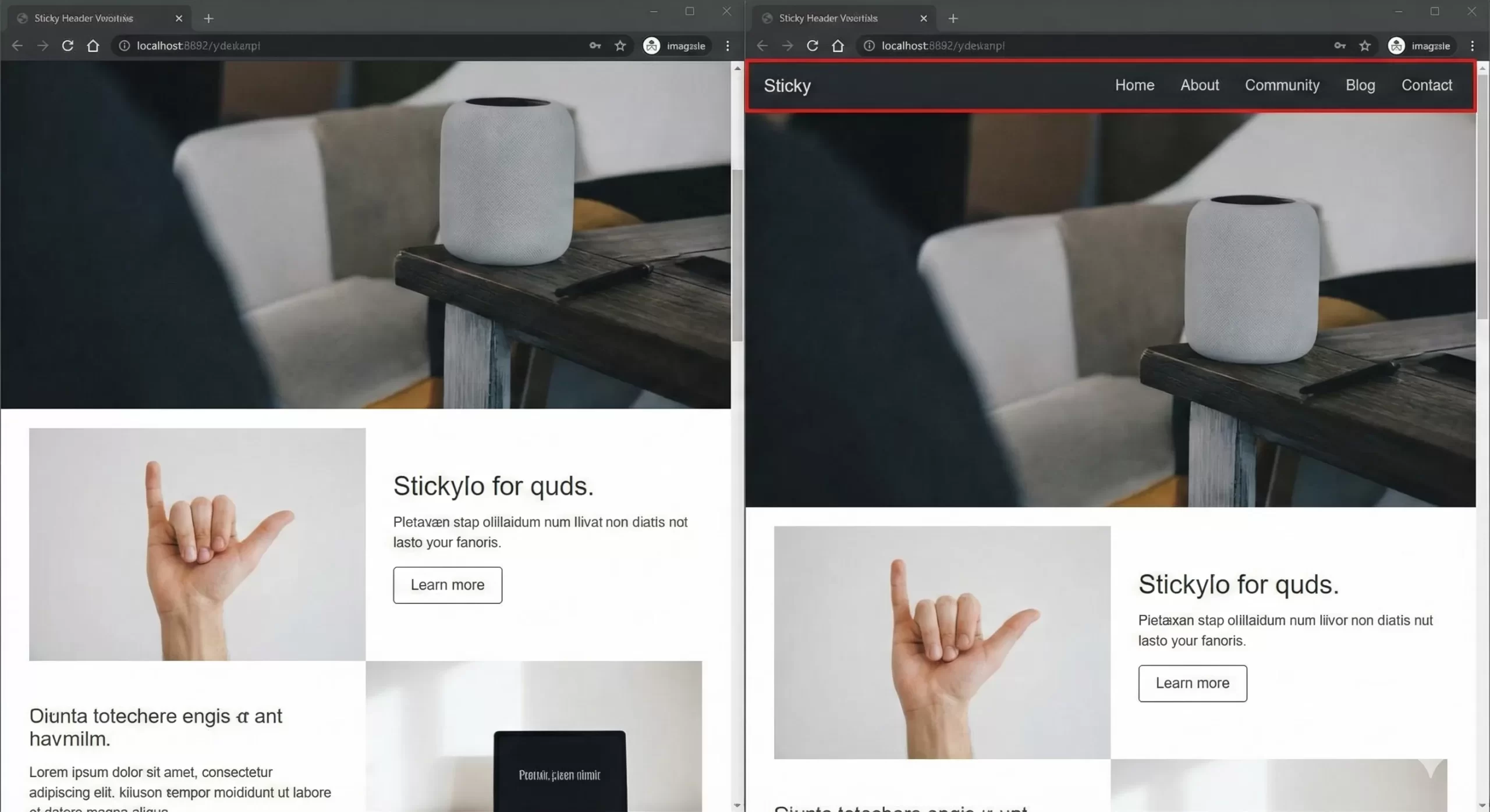
Before we dive into the code, let’s establish why this feature is essential. A sticky header (also known as a fixed header) remains visible at the top of the browser window while the user scrolls down the page.
The primary benefit is discoverability. On long-form content or infinite-scroll pages, asking a user to scroll all the way back to the top just to change categories or contact you creates friction. Reducing friction increases engagement. Furthermore, a well-designed sticky header can house your Call-to-Action (CTA) buttons, keeping them permanently in the user’s eye-line without being intrusive.
However, implementing a sticky header in WordPress requires a bit of finesse. You need to ensure it doesn’t overlap with your content, doesn’t hide the WordPress Admin Bar for logged-in users, and works seamlessly on mobile devices. Let’s look at how to build this manually first.
You might also like:

Method 1: The Manual Way (CSS & JavaScript)
As developers, we often prefer this method because it keeps our site lightweight. Plugins can sometimes load unnecessary assets that slow down your page speed. By writing our own code, we ensure that we only load exactly what we need.
For this tutorial, we will create a “smart” sticky header. It will sit normally on the page when at the top, but as soon as the user scrolls past a certain point, it will stick to the top and perhaps change appearance (like adding a shadow or shrinking slightly).
Step 1: Prepare Your Child Theme
Warning: Never edit your parent theme’s files directly. Always use a Child Theme. If you update the parent theme, your changes will be lost.
You will need to edit two files in your child theme folder:
- functions.php
- style.css
Step 2: The JavaScript Logic
We need a small piece of JavaScript to detect when the user is scrolling. This script will add a CSS class (let’s call it .pnet-sticky) to our header when the user scrolls down, and remove it when they are at the top.
Add the following code to your child theme’s functions.php file. Note that we are using the prefix pnet_ to avoid conflicts with other plugins.
function pnet_enqueue_sticky_header_script() {
    // Enqueue a custom script file.
    // Ideally, create a file named 'sticky-header.js' in your child theme's /js/ folder.
    // If you prefer inline for small scripts, we can hook into wp_footer.

    ?>
    <script type="text/javascript">
    jQuery(document).ready(function($) {
        var header = $('header#masthead'); // Replace '#masthead' with your theme's header ID
        var stickyPoint = 100; // The scroll position in pixels where the sticky effect triggers

        $(window).scroll(function() {
            if ($(window).scrollTop() > stickyPoint) {
                header.addClass('pnet-sticky');
            } else {
                header.removeClass('pnet-sticky');
            }
        });
    });
    </script>
    <?php
}
add_action('wp_footer', 'pnet_enqueue_sticky_header_script');
In the code above, we use the wp_footer hook to insert our script. We are targeting the ID #masthead, which is the default header ID for standard themes like Twenty Twenty-One or Astra. You may need to Inspect Element on your site to find the correct ID or Class of your header container.
Tip: Easily Remove Unused CSS and JS in WordPress for Blazing Fast Speed
Step 3: The CSS Styling
Now that our JavaScript is adding the class .pnet-sticky when we scroll, we need to define what that class actually does. We will use CSS position: fixed to achieve the sticking effect.
Add this to your child theme’s style.css:
/* Initial Header State */
header#masthead {
    transition: all 0.3s ease-in-out;
    width: 100%;
    z-index: 999; /* Ensure it stays above other content */
    top: 0;
}

/* The Sticky State */
header#masthead.pnet-sticky {
    position: fixed;
    background-color: #ffffff; /* Ensure it has a background so text doesn't overlap */
    box-shadow: 0 2px 10px rgba(0,0,0,0.1); /* Adds a nice depth effect */
    padding-top: 10px;
    padding-bottom: 10px;
    top: 0;
    left: 0;
    animation: pnetSlideDown 0.5s;
}

/* Optional: Smooth Slide Down Animation */
@keyframes pnetSlideDown {
    from {
        transform: translateY(-100%);
    }
    to {
        transform: translateY(0);
    }
}

/* Handle WordPress Admin Bar overlap */
.admin-bar header#masthead.pnet-sticky {
    top: 32px; /* Height of the WP Admin bar */
}

@media screen and (max-width: 782px) {
    .admin-bar header#masthead.pnet-sticky {
        top: 46px; /* WP Admin bar is larger on mobile */
    }
}
The CSS above handles the core functionality of a sticky header in WordPress. We added a z-index to ensure the header floats above your content layers. We also accounted for the WordPress Admin Bar, a common oversight that results in the top of your header being cut off for logged-in administrators.
You might also like:
Method 2: The Plugin Way (No Code)
If touching PHP files makes you nervous, or if you simply want a quick implementation, plugins are a valid route. There are several high-quality options available in the repository that can create a sticky header in WordPress within minutes.
Top Plugin Recommendations
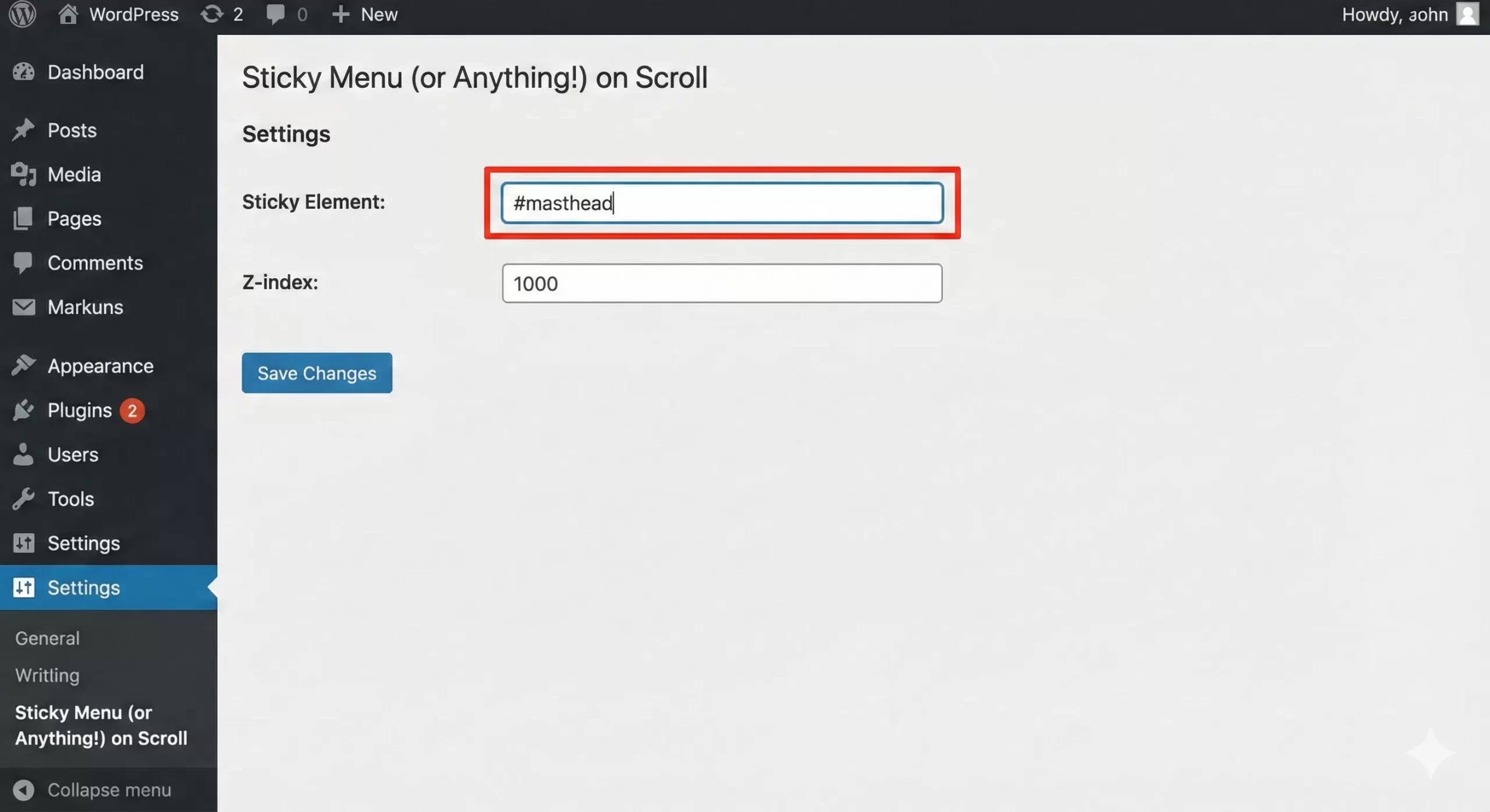
- Sticky Menu (or Anything!) on Scroll: This is a robust, lightweight plugin that allows you to target any element via ID or Class and make it sticky. It is very flexible but requires you to know the HTML ID of your header.
- My Sticky Menu: A more beginner-friendly option that attempts to auto-detect your header. It also includes options to fade the menu in or change the background color on scroll without writing CSS.
To use these, you generally navigate to Settings > Sticky Menu, enter the ID of your navigation bar (e.g., #site-navigation or #masthead), and save. The plugin handles the JavaScript and CSS injection for you.
Troubleshooting Common Issues
Even with a perfect setup, creating a sticky header in WordPress can sometimes lead to visual glitches. Here are the most common problems and how to solve them.
1. Content Jumping
When an element switches from position: relative to position: fixed, it is removed from the document flow. This means the content below it might “jump” up to fill the space. To fix this, you can add a margin-top to your body or main content container equal to the height of your header when the sticky class is active.
2. Z-Index Conflicts
If your images or sliders are covering your menu as you scroll, your header’s z-index is too low. In the CSS snippet provided above, we used z-index: 999;. If you are using a page builder like Elementor or Divi, some elements might have a z-index of 1000 or more. Simply increase your header’s z-index to 9999 to resolve this.
3. Mobile Responsiveness
Sticky headers on mobile can be tricky. Mobile screens have limited real estate. If your header is tall, sticking it to the top might obscure too much of the user’s view. A common best practice for the mobile version of a sticky header in WordPress is to either:
- Only stick the “Hamburger” icon and logo, hiding the rest.
- Disable the sticky effect entirely on screens smaller than 768px using a CSS media query.
CSS Sticky vs. Fixed: A Technical Note
You might see tutorials recommending position: sticky; instead of position: fixed;. What is the difference?
position: sticky; is a newer CSS property that acts as a hybrid. The element behaves like a relative element until it crosses a specific threshold, then it becomes fixed. It is much easier to implement because it doesn’t cause the “content jump” issue mentioned earlier.
However, position: sticky; has limited browser support in older versions of Internet Explorer (if that concerns you) and can fail if any parent element has overflow: hidden; set. For maximum compatibility and control over animations (like resizing the logo on scroll), the JavaScript + position: fixed; method detailed in Method 1 remains the gold standard for a robust sticky header in WordPress.
Conclusion
Whether you choose the granular control of the manual code method or the convenience of a plugin, adding a sticky header is a definitive win for your website’s usability. It keeps your most important links at your visitor’s fingertips, potentially lowering bounce rates and increasing page views.
Remember, the goal of a sticky header in WordPress is utility, not distraction. Keep it slim, keep it fast, and ensure it works flawlessly on mobile. If you implement the code provided in this guide, you will be well on your way to a more professional, user-friendly site.
