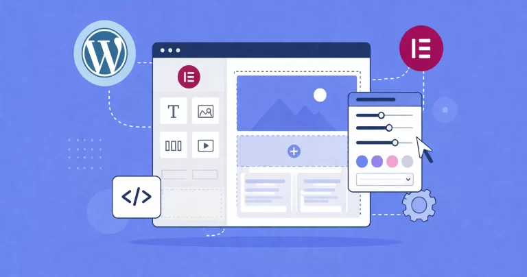
Every pixel counts when you are fighting for user attention. We have all seen them: navigation bars that look great on the surface but hide a clunky, slow-loading mess underneath. If you are running a content-heavy site or an e-commerce store, a standard dropdown often isn’t enough. You need something more robust. You need a WordPress Mega Menu.
Most site owners immediately reach for a plugin. It is the easy route, right? But here at PixelNet, we know the “easy” route often comes with a cost: bloated JavaScript files, excessive DOM elements, and a slower site speed score. Today, we are going to fix that. We are going to build a professional, lightweight mega menu using core WordPress features and CSS.
This guide is for those who want total control. We will walk through the logic, the PHP setup, and the CSS styling required to transform a standard list into a beautiful content interface.
Why Code Your Own WordPress Mega Menu (Without Plugins)?
Before we open our code editors, let’s address the elephant in the room. Why not just install “Mega Menu Plugin X”?
The answer lies in performance and maintainability. Third-party plugins often load their entire asset library on every page of your website, regardless of whether the menu is complex or simple. By coding your own WordPress Mega Menu, you ensure that only the necessary styles are loaded. You strip away the overhead of database queries that plugins often make to retrieve settings. Furthermore, a CSS-based approach relies on the browser’s rendering engine, which is significantly faster than JavaScript-heavy alternatives for layout tasks.
Prerequisites and Preparation
To follow this guide effectively, you should have a basic understanding of HTML and CSS. You will also need access to your theme files, preferably through a Child Theme to prevent your changes from being overwritten during updates.
We will be working with the following files:
functions.php(for registering locations and enqueuing styles)header.php(where the menu is usually output)style.css(for the visual magic)
Note: Always back up your website before editing core theme files.
You might also like:

Step 1: The Strategy
We aren’t going to rewrite the WordPress menu system. That would be overkill. Instead, we are going to leverage the built-in “CSS Classes” feature in the WordPress Menu dashboard. Our strategy is simple:
- We will create a standard nested menu in the WordPress dashboard.
- We will assign a specific CSS class (
pnet-mega-menu) to the top-level items that should become mega menus. - We will use CSS to detect that class and change the dropdown behavior from a narrow list to a full-width container.
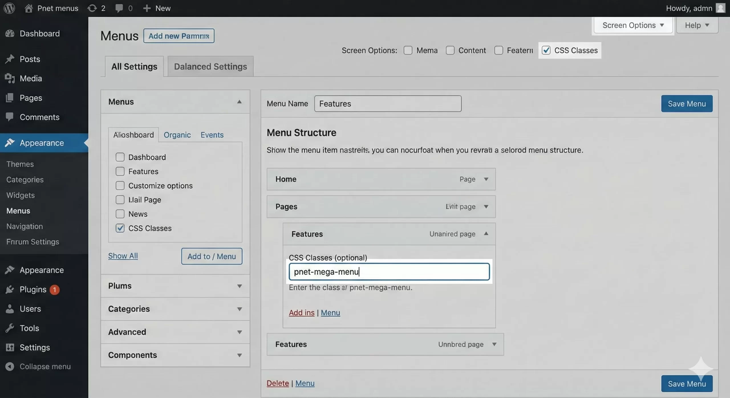
Step 2: Enabling CSS Classes
First, ensure you can add classes to your menu items. Go to your WordPress Dashboard:
- Navigate to Appearance > Menus.
- Look at the top right of the screen and click Screen Options.
- Check the box labeled CSS Classes.
Now, when you expand a menu item, you will see an input field for “CSS Classes (optional)”. This is the trigger we will use to fire our WordPress Mega Menu styles.
Must Read: Easily Display Related Posts in WordPress: Boost Engagement Without Bloat
Step 3: Registering the Menu Location (If Needed)
If you are building a theme from scratch, you need to register a menu location. If you are modifying an existing theme, you can skip this. Open your functions.php file and add the following:
function pnet_register_my_menus() {
    register_nav_menus(
        array(
            'pnet-primary-menu' => __( 'Primary Mega Menu', 'pixelnet' )
        )
    );
}
add_action( 'init', 'pnet_register_my_menus' );
This code tells WordPress to save a spot in the theme for our navigation.
Step 4: The Markup Structure
To make the menu appear, we use the wp_nav_menu() function. This is a standard WordPress function that generates the HTML list for your navigation. In your header.php file, locate where you want the menu to appear.
<nav id="site-navigation" class="main-navigation">
    <?php
    wp_nav_menu( array(
        'theme_location' => 'pnet-primary-menu',
        'menu_id'        => 'pnet-primary-menu',
        'container'      => false, // Avoids wrapping div bloat
        'menu_class'     => 'pnet-menu-items',
    ) );
    ?>
</nav>
By setting container to false, we remove one layer of unnecessary HTML, keeping our DOM clean—a crucial step for a high-performance WordPress Mega Menu.
You might also like:

Step 5: Styling the Mega Menu with CSS
This is where the magic happens. We will use CSS variables and Flexbox to create a layout that is easy to manage. Add the following CSS to your child theme’s style.css file.
Setting the Stage
First, we need to ensure the parent navigation container has relative positioning. This allows our mega menu dropdown to position itself relative to the full width of the nav bar, not just the individual link.
/* Main Menu Container */
.main-navigation {
    position: relative;
    background: #ffffff;
    border-bottom: 1px solid #e0e0e0;
}

/* Reset List Styles */
.pnet-menu-items {
    display: flex;
    list-style: none;
    margin: 0;
    padding: 0;
}

.pnet-menu-items > li {
    position: relative; /* Default dropdown behavior */
}

.pnet-menu-items > li > a {
    display: block;
    padding: 20px 15px;
    text-decoration: none;
    color: #333;
    font-weight: 600;
}
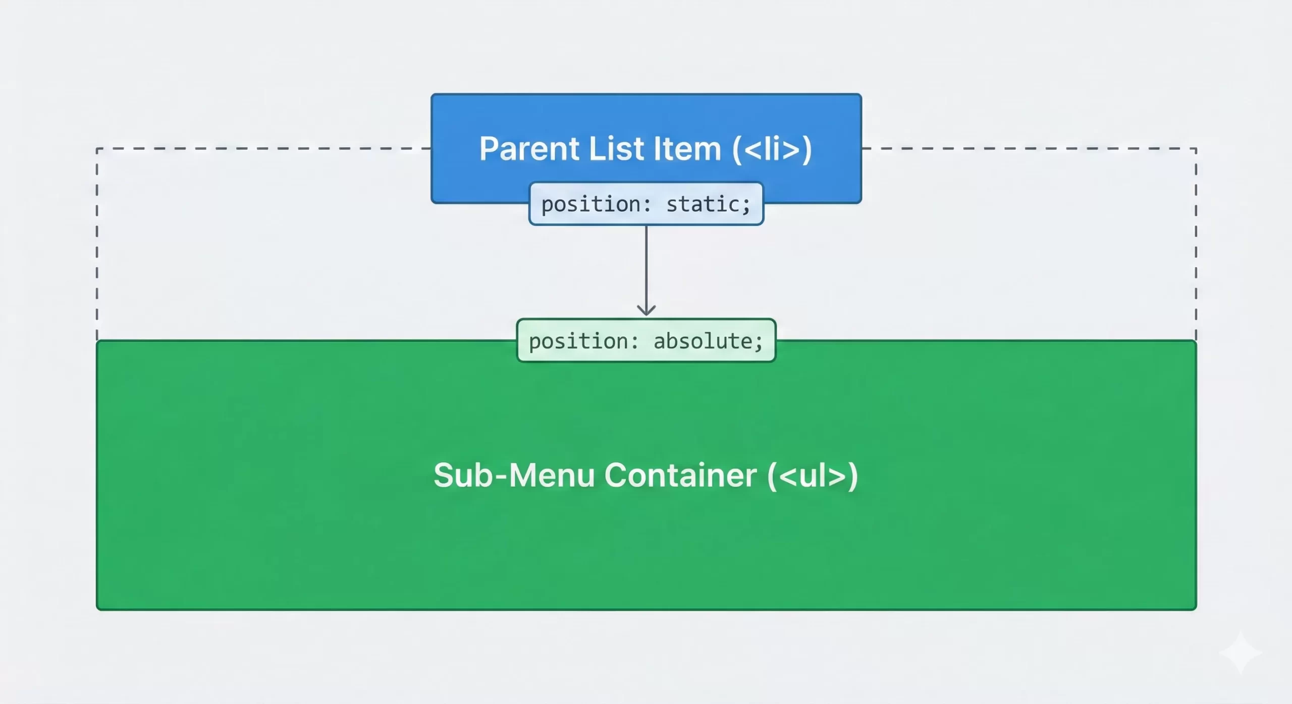
The Mega Menu Logic
Now, we target that specific class we mentioned earlier: pnet-mega-menu. When a user hovers over a list item with this class, we want the child list (the submenu) to span the full width of the container.
/* The Mega Menu Trigger */
.pnet-menu-items > li.pnet-mega-menu {
position: static; /* This allows the child to span full width of the parent nav */
}
/* The Mega Dropdown Container */
.pnet-menu-items > li.pnet-mega-menu > ul.sub-menu {
position: absolute;
left: 0;
right: 0;
width: 100%;
top: 100%; /* Push it directly below the header */
background: #f9f9f9;
padding: 30px;
box-shadow: 0 10px 20px rgba(0,0,0,0.05);
display: flex; /* Use Flexbox for columns */
flex-wrap: wrap;
opacity: 0;
visibility: hidden;
transition: all 0.3s ease;
z-index: 999;
}
/* Show on Hover */
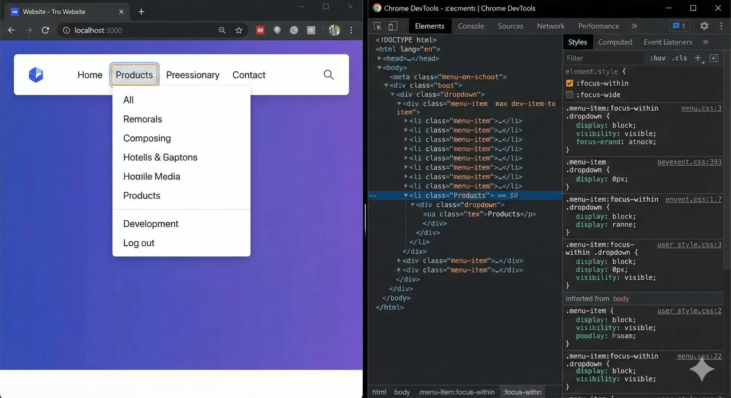
.pnet-menu-items > li.pnet-mega-menu:hover > ul.sub-menu,
.pnet-menu-items > li.pnet-mega-menu:focus-within > ul.sub-menu {
opacity: 1;
visibility: visible;
top: 100%;
}
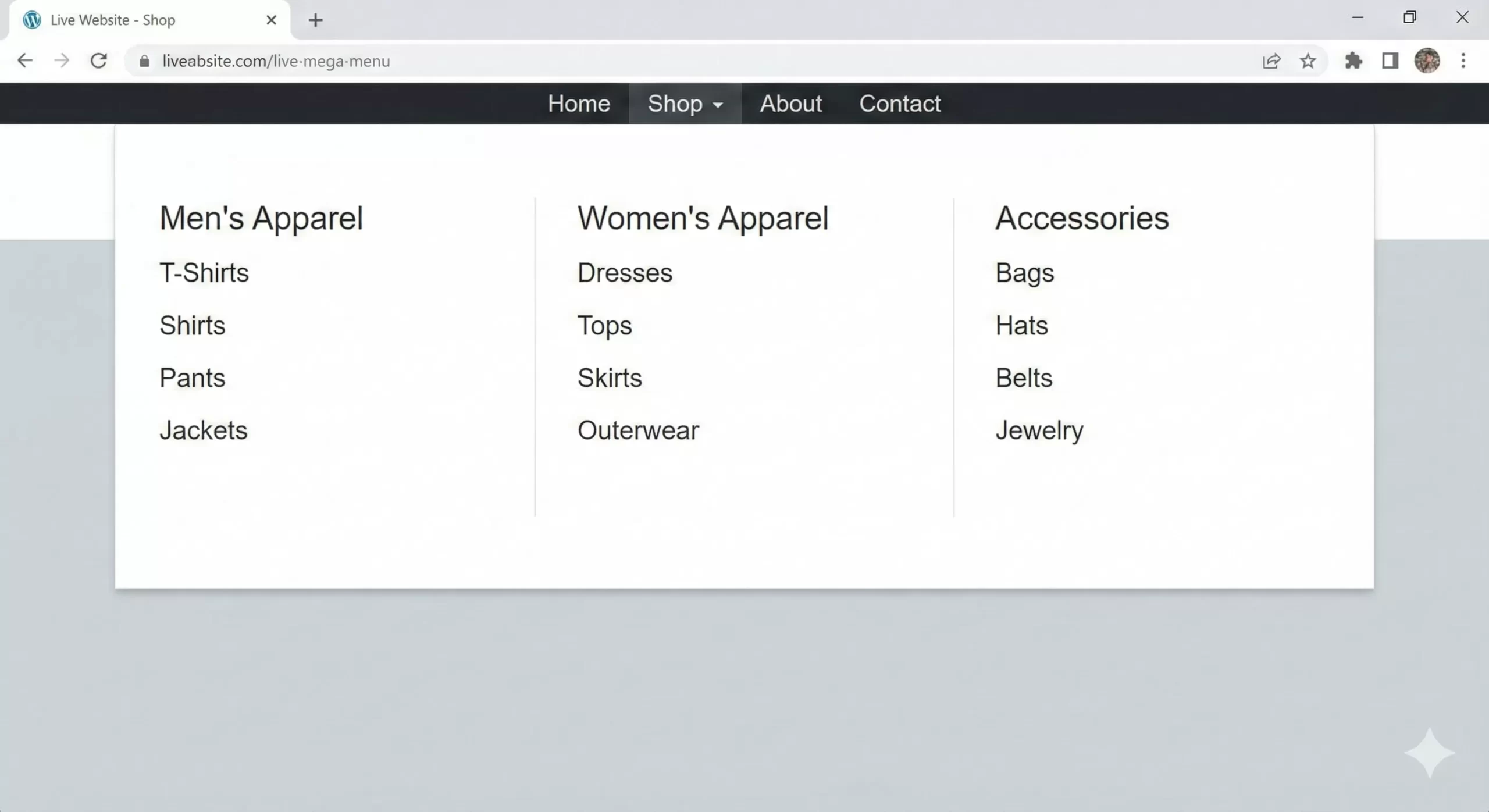
Step 6: Creating Columns
A true WordPress Mega Menu is defined by its ability to display columns of content. Because we applied display: flex to the sub-menu container above, the immediate children (the columns) will automatically align side-by-side.
In your WordPress Menu dashboard, you should structure your menu like this:
- Mega Menu Parent (Class:
pnet-mega-menu)- Column 1 Header
- Link A
- Link B
- Column 2 Header
- Link C
- Link D
- Column 1 Header
Now, let’s style those columns so they look neat and organized.
/* Column Styling */
.pnet-menu-items > li.pnet-mega-menu > ul.sub-menu > li {
    flex: 1; /* Equal width columns */
    padding: 0 20px;
    border-right: 1px solid #ddd;
}

.pnet-menu-items > li.pnet-mega-menu > ul.sub-menu > li:last-child {
    border-right: none;
}

/* Column Headers */
.pnet-menu-items > li.pnet-mega-menu > ul.sub-menu > li > a {
    font-weight: bold;
    text-transform: uppercase;
    color: #000;
    margin-bottom: 10px;
    display: block;
    font-size: 14px;
}

/* Inner Links */
.pnet-menu-items > li.pnet-mega-menu > ul.sub-menu > li > ul {
    list-style: none;
    padding: 0;
}

.pnet-menu-items > li.pnet-mega-menu > ul.sub-menu > li > ul > li > a {
    color: #666;
    padding: 5px 0;
    display: block;
    font-size: 14px;
    transition: color 0.2s;
}

.pnet-menu-items > li.pnet-mega-menu > ul.sub-menu > li > ul > li > a:hover {
    color: #0073aa; /* WordPress Blue */
}
Adding Non-Link Content
Sometimes you want images or descriptions in your WordPress Mega Menu, not just links. Since WordPress menus are inherently lists of links, adding arbitrary HTML can be tricky without a plugin. However, for a developer-centric approach, we can use the “Description” field.
Go back to Screen Options in the Menu Dashboard and enable Description. Add your short text or even an <img> tag into the description field of a menu item.
Then, ensure your theme supports walking through descriptions, or use this snippet in functions.php to append descriptions to menu output:
function pnet_nav_description( $item_output, $item, $depth, $args ) {
    if ( !empty( $item->description ) ) {
        $item_output .= '<span class="pnet-menu-desc">' . $item->description . '</span>';
    }
    return $item_output;
}
add_filter( 'walker_nav_menu_start_el', 'pnet_nav_description', 10, 4 );
Mobile Responsiveness Challenges
A WordPress Mega Menu is fantastic on a desktop, but it can be a nightmare on mobile if not handled correctly. On small screens, we generally want to revert to a standard accordion or stacked vertical menu.
The easiest way to handle this in CSS is to disable the “Mega” positioning on screens smaller than your breakpoint (usually 768px or 1024px).
@media screen and (max-width: 992px) {
    .pnet-menu-items > li.pnet-mega-menu {
        position: relative; /* Revert to standard */
    }

    .pnet-menu-items > li.pnet-mega-menu > ul.sub-menu {
        position: relative;
        top: 0;
        box-shadow: none;
        display: none; /* Hide by default, show on toggle */
        padding: 0;
    }

    /* You would typically use a JS toggle to add a class like .open here */
    .pnet-menu-items > li.open > ul.sub-menu {
        display: block;
    }
}
UX and Accessibility Considerations
When you build a custom WordPress Mega Menu, you must not forget about accessibility. Users navigating with keyboards need to be able to access your sub-menus. The CSS :focus-within pseudo-class we used earlier is a great first step. It ensures that when a user Tabs into a parent link, the dropdown remains open as they Tab through the children.
However, for a fully robust solution, you should consider adding ARIA attributes (aria-haspopup, aria-expanded) via JavaScript. While this tutorial focuses on the CSS/Code approach for layout, accessibility is a topic we will cover deeply in a future guide on PixelNet.
Troubleshooting Common Issues
Even with clean code, things can go wrong. Here are a few common hiccups when implementing a manual WordPress Mega Menu:
The Menu Hides Behind Content
This is a classic Z-index issue. Ensure your .main-navigation or header has a higher z-index than your page content (e.g., standard sliders or hero sections). Setting z-index: 999; on the sub-menu container usually resolves this.
The Menu Overflow is Cut Off
If your header container has overflow: hidden; applied to it, your mega menu will be clipped. You must remove this property from any parent container of the menu for the absolute positioning to work correctly.
Hover is Jittery
If the menu disappears instantly when you move your mouse 1 pixel away, it is bad UX. Adding a transparent border or padding to the top of the sub-menu can bridge the gap between the parent link and the dropdown, ensuring the mouse technically never “leaves” the hover area.
You might also like:
Conclusion
Building a WordPress Mega Menu doesn’t require an annual subscription to a premium plugin. With a clear strategy, a few lines of PHP to register your menu, and the power of Flexbox, you can create a navigation experience that is both fast and beautiful. By owning the code, you own the performance, ensuring your WordPress site remains lean and efficient.