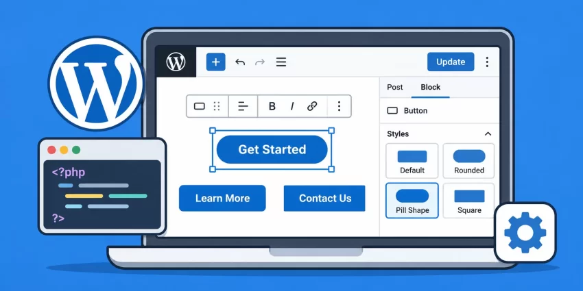
Are you tired of using the same default appearance for every Gutenberg block on your WordPress website? Do you want to give core blocks, such as Buttons, Paragraphs, Quotes, and Images, a unique visual identity without creating custom blocks or installing additional plugins? WordPress Custom Block Styles provide a simple and developer-friendly solution. By registering custom block styles, you can extend the appearance of existing Gutenberg blocks and let content editors switch between predefined design variations directly from the WordPress block editor.
In this comprehensive guide, you will learn how to register WordPress Custom Block Styles using PHP, apply custom CSS classes, create different button shapes, enqueue stylesheets correctly, and make your custom designs available in both the Gutenberg editor and the front end. We will also cover common implementation mistakes and practical techniques for building reusable block styling options.
Step 1: Understand WordPress Custom Block Styles
Before implementing WordPress Custom Block Styles, it is important to understand how Gutenberg handles block styling. WordPress provides a built-in Block Styles API that allows developers to register alternative visual appearances for existing blocks. These styles do not create new blocks or modify the original block functionality. Instead, they add selectable design variations to an existing block.
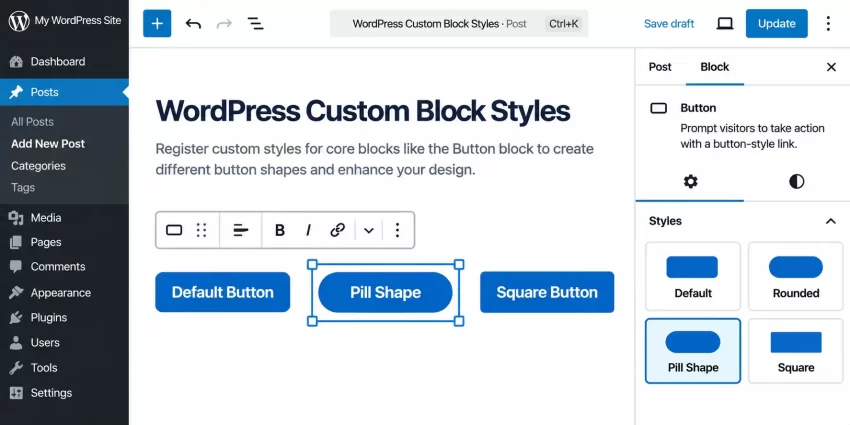
For example, the default Gutenberg Button block supports its standard appearance. You can extend it with additional styles such as Rounded, Pill, Square, Outline, and Shadow. Once registered, these styles appear in the Styles section of the block settings sidebar. When an editor selects a style, WordPress adds a corresponding CSS class to the block markup.
WordPress Custom Block Styles are particularly useful when building client websites, custom themes, design systems, and reusable content layouts. They allow developers to maintain consistent branding while giving content editors enough flexibility to choose between approved design variations.
How the Block Styles API works
The Block Styles API uses the register_block_style() PHP function. You specify the block name, style name, and display label. WordPress then makes that style available in the block editor.
For example, registering a style named rounded-button for core/button creates a CSS class named is-style-rounded-button. You can target that class in your theme stylesheet to control the button’s appearance.
The important distinction is that registering a block style and designing its appearance are two separate tasks. PHP registers the selectable style, while CSS determines how the selected style looks. Both parts are necessary for a complete implementation of WordPress Custom Block Styles.
Block styles versus block variations
Do not confuse block styles with block variations. A block style changes the visual presentation of an existing block without changing its underlying functionality or attributes. A block variation, on the other hand, can provide predefined block attributes, inner blocks, and other configuration settings.
For example, a pill-shaped button is a good use case for a custom block style. A predefined call-to-action section containing a heading, paragraph, and button is better suited to a block pattern or block variation.
Step 2: Prepare Your WordPress Development Environment
Before registering WordPress Custom Block Styles, prepare your development environment and identify where the implementation should live. You can register custom styles from a custom theme, a child theme, or a site-specific plugin. For functionality that should remain available even when the active theme changes, a site-specific plugin is generally the better option.
In this tutorial, we will use a site-specific plugin and a separate CSS stylesheet. This approach keeps the PHP registration logic independent of the theme’s presentation layer and makes the implementation easier to maintain.
Prerequisites
- WordPress 5.3 or later, with the Gutenberg block editor enabled.
- PHP 8.0 or later recommended for a modern development environment.
- Basic knowledge of PHP, CSS, and WordPress hooks.
- Access to your WordPress site’s files through FTP, SFTP, or a hosting file manager.
- A code editor such as Visual Studio Code.
- A full backup of your WordPress website before modifying theme or plugin files.
- A staging environment for testing custom block styles before deploying them to production.
Choose where to register custom styles
You have two primary options for registering WordPress Custom Block Styles:
- Child theme: Add the registration code to your child theme’s
functions.phpfile. This is appropriate when the custom styles are tightly connected to a particular theme’s design system. - Site-specific plugin: Add the registration code to a custom plugin. This is recommended when you want your custom styles to remain available after changing themes.
For this guide, we will create a small plugin named pnet-custom-block-styles. You can replace the prefix with your own project-specific prefix if required.
Create the plugin directory and files
Navigate to the wp-content/plugins/ directory and create a new folder named pnet-custom-block-styles. Inside that folder, create two files: pnet-custom-block-styles.php and pnet-block-styles.css.
Your plugin directory should look like this:
wp-content/
└── plugins/
    └── pnet-custom-block-styles/
        ├── pnet-custom-block-styles.php
        └── pnet-block-styles.css
This structure separates PHP functionality from CSS presentation. It also makes future updates to WordPress Custom Block Styles easier because you can modify the registration logic and visual styling independently.
You might also like:

Step 3: Create a Plugin to Register Custom Block Styles
Now that the development environment is ready, create the main plugin file. The plugin will register our custom styles during WordPress initialization using the init action hook. This ensures that the block styles are registered at the appropriate point in the WordPress loading process.
We will begin with a simple example that registers three custom styles for the core Button block: Rounded, Pill, and Square. These styles will be available directly inside the Gutenberg editor.
Add the plugin header
Open pnet-custom-block-styles.php and add the following plugin header. WordPress uses this information to identify and display the plugin in the Plugins administration screen.
<?php
/**
 * Plugin Name: PNET Custom Block Styles
 * Description: Registers custom styles for WordPress core blocks.
 * Version: 1.0.0
 * Author: PNET
 * Text Domain: pnet-custom-block-styles
 */

if ( ! defined( 'ABSPATH' ) ) {
    exit;
}
The ABSPATH check prevents direct access to the PHP file outside the WordPress environment. This is a standard security practice for WordPress plugins and theme files.
Register custom styles for the Button block
Next, add a function that registers the desired button styles. The first argument of register_block_style() identifies the target block, while the second argument contains the style configuration. The name value is the internal style slug, and the label value is displayed to content editors.
Here is the complete registration function for our three button styles:
/**
 * Register custom styles for the core Button block.
 */
function pnet_register_button_block_styles() {

    register_block_style(
        'core/button',
        array(
            'name'  => 'rounded-button',
            'label' => __( 'Rounded', 'pnet-custom-block-styles' ),
        )
    );

    register_block_style(
        'core/button',
        array(
            'name'  => 'pill-button',
            'label' => __( 'Pill Shape', 'pnet-custom-block-styles' ),
        )
    );

    register_block_style(
        'core/button',
        array(
            'name'  => 'square-button',
            'label' => __( 'Square', 'pnet-custom-block-styles' ),
        )
    );
}
add_action( 'init', 'pnet_register_button_block_styles' );
Notice that we use the core/button block name rather than a CSS class or the visible block title. WordPress identifies core blocks using their registered namespace and block name. The init hook makes sure the styles are registered before the editor needs to display them.
Once the plugin is activated, WordPress will recognize the three registered styles. However, the styles will not automatically have the visual appearance we want. We must define the corresponding CSS classes in the next step.
Step 4: Add CSS for Custom Button Shapes
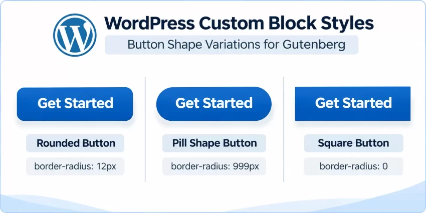
Registering WordPress Custom Block Styles makes the styles selectable, but CSS is responsible for their actual appearance. When a user selects one of the registered styles, WordPress adds an is-style- class to the relevant block wrapper. We can target these classes to customize the button shape without modifying the original Gutenberg block.
For the Button block, the outer wrapper typically uses the .wp-block-button class, while the clickable anchor uses .wp-block-button__link. Our CSS should target the link element so that the button’s shape, padding, and border are applied to the visible clickable area.
Define the Rounded button style
The Rounded style creates a conventional button with moderately rounded corners. This is a good choice for corporate websites, landing pages, and general-purpose call-to-action buttons.
/* Rounded Button */
.wp-block-button.is-style-rounded-button .wp-block-button__link {
    border-radius: 12px;
}
Define the Pill Shape button style
The Pill Shape style creates fully rounded button edges. A large border radius makes the button appear capsule-shaped while preserving its original block functionality. This design works particularly well for modern landing pages and compact call-to-action elements.
/* Pill Shape Button */
.wp-block-button.is-style-pill-button .wp-block-button__link {
    border-radius: 999px;
    padding: 12px 28px;
}
Define the Square button style
The Square style removes rounded corners entirely. It is useful for minimal designs, dashboard interfaces, and websites that use a sharp-edged visual design system.
/* Square Button */
.wp-block-button.is-style-square-button .wp-block-button__link {
    border-radius: 0;
}
Combine the CSS styles into one stylesheet
Instead of maintaining separate CSS snippets, combine all three definitions inside pnet-block-styles.css. This keeps your WordPress Custom Block Styles organized and allows you to add more variations later without cluttering the plugin’s PHP file.
/* PNET Custom Button Block Styles */

/* Rounded Button */
.wp-block-button.is-style-rounded-button .wp-block-button__link {
    border-radius: 12px;
}

/* Pill Shape Button */
.wp-block-button.is-style-pill-button .wp-block-button__link {
    border-radius: 999px;
    padding: 12px 28px;
}

/* Square Button */
.wp-block-button.is-style-square-button .wp-block-button__link {
    border-radius: 0;
}
These selectors are intentionally specific to the Button block. This prevents the custom shape rules from affecting unrelated links or buttons elsewhere on the website. You can also extend these styles with custom colors, borders, hover effects, and typography if your design system requires them.
Step 5: Enqueue CSS in the Block Editor and Front End
Now we need to load the CSS file created in the previous step. This is an important part of implementing WordPress Custom Block Styles because registering a style does not automatically load an external stylesheet that you created yourself.
WordPress provides the wp_enqueue_block_style() function specifically for loading styles associated with individual blocks. It is preferable to use this function when you want to load a stylesheet only when the relevant block is used. It also supports loading block styles in the editor and on the front end.
Enqueue the stylesheet for the Button block
Add the following code to your plugin file. This registers the stylesheet against the core/button block and provides its URL and filesystem path.
/**
 * Enqueue custom styles for the core Button block.
 */
function pnet_enqueue_button_block_styles() {

    $css_file = plugin_dir_path( __FILE__ ) . 'pnet-block-styles.css';

    wp_enqueue_block_style(
        'core/button',
        array(
            'handle' => 'pnet-button-block-styles',
            'src'    => plugin_dir_url( __FILE__ ) . 'pnet-block-styles.css',
            'path'   => $css_file,
            'ver'    => file_exists( $css_file )
                ? filemtime( $css_file )
                : '1.0.0',
        )
    );
}
add_action( 'init', 'pnet_enqueue_button_block_styles' );
The handle provides a unique identifier for the stylesheet. The src points to its public URL, while path provides the local filesystem location. Using filemtime() as the version value helps browsers load updated CSS after you modify the file.
Because this stylesheet is associated with the core Button block, WordPress can manage its loading according to block usage. This is more efficient than unnecessarily loading the same CSS on every page of a large website.
Complete plugin file
For convenience, here is the complete PHP implementation combining the plugin header, registration function, and stylesheet enqueue logic. Replace the existing contents of pnet-custom-block-styles.php with this version if you have been following the individual steps.
<?php
/**
 * Plugin Name: PNET Custom Block Styles
 * Description: Registers custom styles for WordPress core blocks.
 * Version: 1.0.0
 * Author: PNET
 * Text Domain: pnet-custom-block-styles
 */

if ( ! defined( 'ABSPATH' ) ) {
    exit;
}

/**
 * Register custom styles for the core Button block.
 */
function pnet_register_button_block_styles() {

    $button_styles = array(
        'rounded-button' => __( 'Rounded', 'pnet-custom-block-styles' ),
        'pill-button'    => __( 'Pill Shape', 'pnet-custom-block-styles' ),
        'square-button'  => __( 'Square', 'pnet-custom-block-styles' ),
    );

    foreach ( $button_styles as $style_name => $style_label ) {

        register_block_style(
            'core/button',
            array(
                'name'  => $style_name,
                'label' => $style_label,
            )
        );
    }
}
add_action( 'init', 'pnet_register_button_block_styles' );

/**
 * Enqueue custom CSS for the core Button block.
 */
function pnet_enqueue_button_block_styles() {

    $css_file = plugin_dir_path( __FILE__ ) . 'pnet-block-styles.css';

    wp_enqueue_block_style(
        'core/button',
        array(
            'handle' => 'pnet-button-block-styles',
            'src'    => plugin_dir_url( __FILE__ ) . 'pnet-block-styles.css',
            'path'   => $css_file,
            'ver'    => file_exists( $css_file )
                ? filemtime( $css_file )
                : '1.0.0',
        )
    );
}
add_action( 'init', 'pnet_enqueue_button_block_styles' );
This complete implementation uses an array and a loop to register multiple styles efficiently. Instead of repeating the registration function for every new button shape, you can add another key-value pair to the $button_styles array. This makes the code easier to extend and maintain.
Pro Tip
pnet_ reduces the possibility of naming conflicts with other plugins and themes. For larger projects, consider using a PHP namespace or a dedicated class. Step 6: Activate and Test Custom Block Styles
With the registration and CSS implementation complete, it is time to test WordPress Custom Block Styles in the Gutenberg editor. Testing both the editing interface and the published page is essential because a style that appears correctly in the editor may not necessarily be loaded correctly on the front end.
Activate the custom plugin
Navigate to WordPress Dashboard → Plugins → Installed Plugins. Locate PNET Custom Block Styles and click Activate. If the plugin does not appear, verify that the plugin PHP file is located directly inside the plugin directory and that its header is correctly formatted.
After activation, open an existing post or create a new page using the Gutenberg editor. Insert a Button block or select an existing Button block in the content area.
Select a registered button style
Select the Button block and open the Settings sidebar. Navigate to the Styles panel. You should now see the registered styles, including Rounded, Pill Shape, and Square, alongside the default style.
Click each style to preview the corresponding appearance. The selected style should immediately change the button’s shape within the editor. WordPress will also add the corresponding is-style- class to the block markup.
Verify the published front end
Save or update the post and open its public URL in a separate browser tab. Check whether the selected button style appears correctly on the published page.
If the editor displays the correct shape but the front end does not, inspect the page source and browser developer tools. Verify that the expected stylesheet is loaded and that the button markup contains the correct class. Also check whether another stylesheet is overriding your custom CSS.
Inspect the generated HTML
For example, selecting the Pill Shape style should produce markup similar to the following:
<div class="wp-block-button is-style-pill-button">
    <a class="wp-block-button__link wp-element-button">
        Get Started
    </a>
</div>
The is-style-pill-button class identifies the selected WordPress Custom Block Styles variation. This class is the connection between the PHP registration and the CSS presentation. If the class is missing, check the registration function and verify that you selected the correct style in the editor.
You might also like:

Step 7: Register Custom Styles for Other Core Blocks
Although this tutorial focuses on Button shapes, WordPress Custom Block Styles are not limited to buttons. You can register additional styles for many core Gutenberg blocks, including Paragraph, Image, Quote, Heading, and Group. This makes the Block Styles API useful for building a consistent design system across an entire website.
The process is almost identical: identify the correct core block name, register a unique style slug, and write CSS targeting the generated style class.
Register a custom style for the Quote block
For example, you can create a highlighted Quote style for testimonials, customer feedback, and important quotations.
/**
 * Register custom styles for the Quote block.
 */
function pnet_register_quote_block_styles() {

    register_block_style(
        'core/quote',
        array(
            'name'  => 'highlighted-quote',
            'label' => __( 'Highlighted Quote', 'pnet-custom-block-styles' ),
        )
    );
}
add_action( 'init', 'pnet_register_quote_block_styles' );
Add the following CSS to your stylesheet to give the selected Quote block a highlighted appearance:
/* Highlighted Quote */
.wp-block-quote.is-style-highlighted-quote {
    border-left: 5px solid #2271b1;
    background: #f0f6fc;
    padding: 20px 24px;
    border-radius: 6px;
}
Register a custom style for the Image block
You can also register a custom style for the core Image block. For example, a circular image style can be useful for author portraits, team members, and profile images.
/**
 * Register a circular image style.
 */
function pnet_register_image_block_styles() {

    register_block_style(
        'core/image',
        array(
            'name'  => 'circular-image',
            'label' => __( 'Circular Image', 'pnet-custom-block-styles' ),
        )
    );
}
add_action( 'init', 'pnet_register_image_block_styles' );
Then add the corresponding CSS:
/* Circular Image */
.wp-block-image.is-style-circular-image img {
    border-radius: 50%;
    aspect-ratio: 1 / 1;
    object-fit: cover;
}
Keep in mind that the circular appearance works best when the source image is square or when the image container is explicitly constrained to a square aspect ratio. You should test the result with different image dimensions before making this style available to editors.
Organize multiple block registrations
For a larger plugin, you can register styles for several core blocks inside a single registration function. This keeps the implementation centralized and makes it easier to manage your WordPress Custom Block Styles.
/**
 * Register styles for multiple core blocks.
 */
function pnet_register_additional_block_styles() {

    $block_styles = array(
        'core/quote' => array(
            'highlighted-quote' => __( 'Highlighted Quote', 'pnet-custom-block-styles' ),
        ),
        'core/image' => array(
            'circular-image' => __( 'Circular Image', 'pnet-custom-block-styles' ),
        ),
    );

    foreach ( $block_styles as $block_name => $styles ) {

        foreach ( $styles as $style_name => $style_label ) {

            register_block_style(
                $block_name,
                array(
                    'name'  => $style_name,
                    'label' => $style_label,
                )
            );
        }
    }
}
add_action( 'init', 'pnet_register_additional_block_styles' );
For every newly registered block style, make sure that its corresponding CSS is loaded in both the editor and the front end. When using wp_enqueue_block_style(), register the stylesheet against the relevant block. You can also maintain separate stylesheets for different blocks if that makes your plugin easier to organize.
Did you know: Customizing the visual hierarchy of your single product pages can significantly boost user engagement? You can seamlessly configure a WooCommerce Price Below Description layout using just a few lines of highly optimized, native WordPress PHP code without relying on heavy page builders.
Step 8: Troubleshoot Common WordPress Custom Block Styles Errors
Even though the Block Styles API is straightforward, developers can encounter problems when registering styles, loading CSS, or testing the Gutenberg editor. The following are some common issues and their solutions.
Custom styles do not appear in the Gutenberg editor
Possible cause: The registration function is not running, the init hook is missing, or the registered block name is incorrect.
Solution: Verify that your plugin is activated and that the registration function is connected to the init action. Check that the block name is correct, such as core/button, rather than using a display label like Button. Also check the PHP error log for fatal errors.
Custom styles appear in the editor but not on the front end
Possible cause: The custom stylesheet is loaded only in the editor or its front-end URL is incorrect.
Solution: Use wp_enqueue_block_style() with the correct block name, stylesheet URL, and filesystem path. Inspect the published page’s Network panel to confirm that the CSS file loads successfully. Also check whether caching or CSS optimization plugins are serving an outdated stylesheet.
The custom CSS class is not applied to the block
Possible cause: The style has not been registered correctly or the wrong block has been selected.
Solution: Confirm that the style name in PHP matches the slug used in the CSS selector. For example, registering pill-button produces is-style-pill-button, not is-style-pill. Select the style from the Styles panel and save the post before inspecting the front-end markup.
The CSS does not affect the button shape
Possible cause: The CSS selector targets the block wrapper instead of the clickable button link, or another stylesheet has higher specificity.
Solution: Use a selector such as .wp-block-button.is-style-pill-button .wp-block-button__link. Inspect the computed styles in your browser developer tools and identify any conflicting declarations. If necessary, adjust the selector specificity instead of immediately relying on !important.
Changes to CSS are not visible after updating the stylesheet
Possible cause: Browser caching, server caching, or a CDN is serving an older CSS file.
Solution: Use a dynamic stylesheet version such as filemtime() to update the cache-busting version whenever the CSS file changes. Clear any WordPress caching plugin, server cache, and CDN cache if required.
The plugin causes a PHP fatal error
Possible cause: A syntax error, an incorrect function declaration, or an unsupported WordPress API.
Solution: Check the PHP error log and confirm that your WordPress installation supports the functions used in the implementation. The register_block_style() API was introduced in WordPress 5.3, while wp_enqueue_block_style() was introduced in WordPress 5.9. If you need compatibility with older WordPress versions, use an appropriate alternative stylesheet enqueue strategy.
Backup Required
Step 9: Follow Best Practices for Custom Block Styles
Once you understand how WordPress Custom Block Styles work, you can use the API to build a more consistent and maintainable Gutenberg experience. However, a good implementation should consider performance, accessibility, compatibility, and long-term maintenance rather than focusing only on visual appearance.
Use meaningful style names
Choose descriptive style slugs such as pill-button, highlighted-quote, and circular-image. Avoid generic names such as style-1 or custom-2. Meaningful names make your CSS easier to understand and reduce confusion when managing multiple WordPress Custom Block Styles.
Use a consistent naming prefix
Use a project-specific prefix for PHP functions, stylesheet handles, and custom style slugs where appropriate. This helps prevent naming conflicts with other plugins and themes. WordPress-generated classes will still follow the standard is-style- convention.
Keep editor and front-end styling consistent
A custom block style should look consistent in the Gutenberg editor and on the published website. Use block-specific stylesheets and test both environments. Avoid relying exclusively on editor-only CSS because the published page must receive the same visual rules.
Prioritize accessibility
Do not sacrifice usability for visual design. Buttons should have sufficient color contrast, readable text, visible keyboard focus states, and comfortable clickable areas. Rounded, pill-shaped, and square designs should remain accessible regardless of their visual appearance.
Avoid unnecessary CSS overrides
Use specific selectors targeting the relevant block and style class. Avoid broad selectors that unintentionally affect every button or link on the website. Also avoid excessive use of !important, as it makes future customization more difficult.
Consider theme.json when appropriate
For projects built around a modern block theme, consider using theme.json for global settings and design tokens such as colors, typography, spacing, and other supported design controls. The Block Styles API complements these settings by providing named, selectable visual variations for individual blocks.
Conclusion
Registering WordPress Custom Block Styles is an effective way to extend Gutenberg’s design capabilities without creating custom blocks or adding unnecessary plugins. Using the built-in Block Styles API, you can register alternative appearances for existing core blocks and make them available to content editors directly inside the WordPress block editor.
In this tutorial, we created a site-specific plugin, registered Rounded, Pill Shape, and Square styles for the core Button block, added the corresponding CSS, and loaded the stylesheet using wp_enqueue_block_style(). We also explored how to extend the same approach to Quote and Image blocks, troubleshoot common issues, and follow practical development best practices.
Whether you are developing a custom WordPress theme, building client websites, or maintaining a reusable design system, WordPress Custom Block Styles offer a clean, scalable, and developer-friendly way to give core Gutenberg blocks a consistent visual identity while keeping content editing simple.
For further technical reference, explore the official WordPress register_block_style() documentation and the wp_enqueue_block_style() reference.