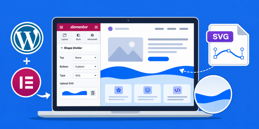
Elementor provides several built-in shape divider designs, but these presets can feel limiting when you want to create a distinctive website layout that matches your brand identity. If you need custom curves, waves, geometric patterns, or uniquely designed section transitions, the default options may not be enough. Fortunately, you can create Elementor Custom Shape Dividers using custom SVG graphics and CSS without modifying Elementor’s core files. In this tutorial, we’ll explore a developer-friendly approach to adding fully customizable SVG shape dividers to Elementor sections and containers, with complete control over positioning, colors, responsiveness, and sizing.
Understanding Elementor Shape Dividers
Elementor’s Shape Divider feature allows you to add decorative shapes to the top or bottom edges of sections and containers. These shapes create visual transitions between different content areas, helping you build more engaging page layouts without relying on additional image-editing tools.
By default, Elementor includes several predefined shapes, such as waves, curves, triangles, mountains, and other decorative patterns. You can configure their height, width, position, color, and layering through the Elementor editor. However, Elementor does not provide a native interface for uploading arbitrary SVG files as new entries in its built-in Shape Divider dropdown.
This is where Elementor Custom Shape Dividers become useful. By combining custom SVG graphics with CSS positioning, you can introduce virtually any shape into your page design while keeping the graphic scalable and responsive.
SVG (Scalable Vector Graphics) is particularly suitable for this purpose because it maintains sharp edges at different screen resolutions. Unlike raster images such as PNG or JPEG, SVG graphics can scale without becoming pixelated.
Prerequisites
Before implementing custom shape dividers, make sure you have the following requirements covered:
- A working WordPress installation.
- Elementor installed and activated. Elementor Pro is optional for this implementation.
- Basic knowledge of HTML, CSS, and WordPress.
- Access to the WordPress dashboard and Elementor editor.
- A custom SVG shape file or an SVG editor such as Figma, Inkscape, or Adobe Illustrator.
- PHP 8.0 or higher is recommended for a modern WordPress environment.
- Access to your theme’s custom CSS area or a child theme stylesheet.
- A complete backup of your WordPress website before making changes.
Backup Required
Step 1: Understand the SVG Structure for Custom Shape Dividers
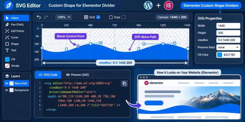
The first step is understanding how SVG graphics work and why they are useful for Elementor Custom Shape Dividers. An SVG file describes vector shapes using XML-based markup. It can contain paths, curves, polygons, and other graphical elements that browsers can render directly.
For a shape divider, you generally need a transparent SVG canvas containing a filled shape along one edge. The remaining transparent area allows the underlying section background to remain visible. This makes SVG an excellent choice for creating smooth transitions between two Elementor containers.
1.1 Create a basic SVG shape
You can create a custom shape using an SVG editor or write the SVG markup manually. The following example creates a simple wave with a blue filled area and a transparent background. The SVG uses a viewBox of 1440 by 200 units, allowing the browser to scale the graphic to different container widths.
<svg xmlns="http://www.w3.org/2000/svg"
     viewBox="0 0 1440 200"
     preserveAspectRatio="none">
    <path
        d="M0,120 C240,200 480,20 720,100
           C960,180 1200,40 1440,120
           L1440,200 L0,200 Z"
        fill="#2271B1"
    />
</svg>
The SVG contains three important elements:
- viewBox: Defines the internal coordinate system of the SVG graphic. It allows the shape to scale independently of its displayed dimensions.
- path: Defines the actual wave shape using SVG path commands. The C command creates smooth Bézier curves, while L draws straight lines.
- fill: Defines the color applied to the shape. You can replace the hexadecimal color with any suitable brand color.
The preserveAspectRatio="none" attribute allows the graphic to stretch to fill its container. This is particularly useful for full-width dividers, although you should inspect the resulting curve on unusually wide and narrow screens.
1.2 Design alternative custom shapes
You are not limited to wave patterns. You can create diagonal cuts, curved transitions, pointed edges, multiple overlapping waves, or geometric shapes by modifying the SVG path. For example, a triangular divider can be created using a polygon instead of a path.
<svg xmlns="http://www.w3.org/2000/svg"
     viewBox="0 0 1440 200"
     preserveAspectRatio="none">
    <polygon
        points="0,200 720,0 1440,200"
        fill="#2271B1"
    />
</svg>
For more information about SVG elements, paths, and coordinate systems, refer to the MDN SVG documentation.
Step 2: Prepare and Upload Your Custom SVG File
After designing your shape, the next step is preparing the SVG file for use on your WordPress website. Although SVG graphics are supported by modern browsers, WordPress does not allow SVG uploads through the Media Library by default because SVG files can contain potentially dangerous markup and scripts.
For this implementation, we will use an external SVG file as a CSS background image. This keeps the divider separate from the Elementor content and makes it easier to reuse the same design across multiple pages.
2.1 Optimize and sanitize the SVG
Before uploading the SVG, remove unnecessary metadata, editor-specific attributes, embedded scripts, event handlers, and unused elements. You should also avoid embedding external resources or unnecessary references inside the file.
You can use an SVG optimization tool such as SVGOMG to reduce unnecessary markup. However, optimization is not a substitute for security sanitization. Only upload SVG files from trusted sources and ensure that they have been sanitized using a reliable SVG sanitizer.
SVG Security
2.2 Enable safe SVG uploads
The simplest approach is to use a maintained WordPress plugin that supports SVG sanitization during upload. Search for a reputable SVG upload plugin in the WordPress plugin directory, review its maintenance history, compatibility, and security practices, and configure it to sanitize uploaded files.
Once the plugin is installed and configured, navigate to Media > Add New Media File and upload your optimized SVG file. For this tutorial, use a descriptive filename such as custom-wave-divider.svg.
After uploading, open the attachment details and copy the SVG file URL. You will need this URL when configuring the CSS background image in the next step.
2.3 Verify the uploaded SVG
Open the SVG URL in a new browser tab. You should see the shape rendered against a transparent background. If the browser displays an error or the graphic is missing, check the SVG markup, MIME type, upload plugin settings, and file permissions.
Keep the SVG file in the WordPress Media Library rather than hardcoding a temporary development URL. This makes it easier to manage the asset and move it between environments.
Did you know: You can completely transform the editor experience by developing Elementor Custom Controls to build highly specialized UI elements without writing messy workarounds?
Step 3: Add a Custom CSS Class to the Elementor Container
Now that your SVG is ready, you need to identify the Elementor container where the custom shape divider will appear. Elementor containers use CSS-based layouts, so you can target a specific container using a custom CSS class without modifying Elementor’s internal files or generated markup.
3.1 Open the Elementor editor
Navigate to Pages > All Pages in your WordPress dashboard and edit the page where you want to add the divider. Click Edit with Elementor to launch the visual editor.
Select the container where you want the shape divider. For example, if you want a wave at the bottom of a hero section, select the hero container rather than the container immediately below it.
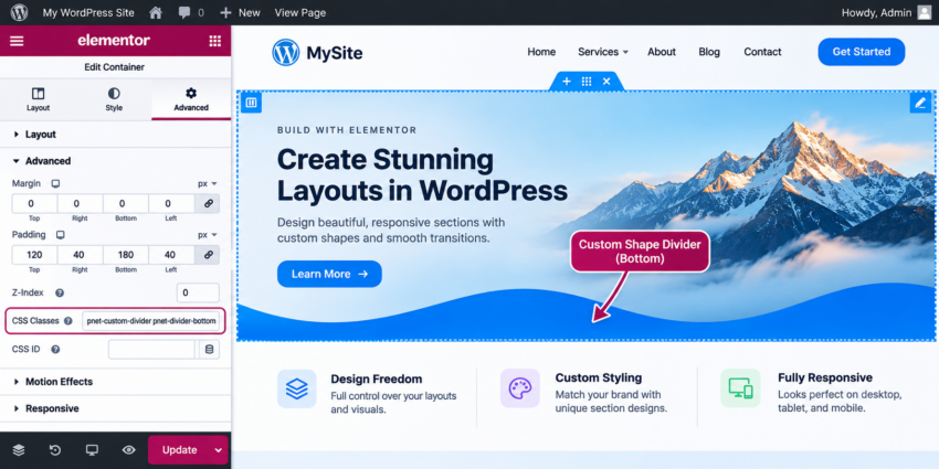
3.2 Assign a CSS class
With the container selected, open the Advanced tab in the Elementor panel. Locate the CSS Classes field under the Layout or Advanced settings, depending on your Elementor version.
Enter the following class name:
pnet-custom-divider pnet-divider-bottom
Do not include a leading dot when entering class names in Elementor. The dot is only required when referencing a CSS class in a stylesheet.
You can use the same approach for a top divider by assigning the following classes:
pnet-custom-divider pnet-divider-top
Using separate directional classes makes it possible to control the divider’s position independently. It also allows you to reuse the same base CSS for multiple containers.
3.3 Understand the positioning requirements
The custom divider will be positioned absolutely inside its parent Elementor container. The parent therefore needs to establish a positioning context using position: relative. The divider itself will use a pseudo-element, which means you do not need to add an additional HTML widget or create another Elementor container.
This approach is lightweight, reusable, and compatible with both Elementor Free and Pro because the custom CSS can be added through your theme or a separate stylesheet.
Step 4: Implement the Custom Shape Divider Using CSS
This is the most important implementation step. We will use the CSS ::before pseudo-element to render the SVG graphic inside the Elementor container. The pseudo-element acts as a decorative layer, allowing the divider to remain independent of the actual page content.
4.1 Add the base CSS
First, define the base styles for the custom divider. These styles establish the positioning context, create the pseudo-element, and ensure that the divider does not interfere with normal mouse interactions.
You can add this CSS under Appearance > Customize > Additional CSS, if your theme provides that option. Alternatively, use your child theme’s stylesheet or a maintained custom CSS solution.
/* Parent container */
.pnet-custom-divider {
    position: relative;
    overflow: hidden;
}

/* Common divider styles */
.pnet-custom-divider::before {
    content: "";
    position: absolute;
    left: 0;
    width: 100%;
    height: 120px;
    background-repeat: no-repeat;
    background-position: center;
    background-size: 100% 100%;
    pointer-events: none;
    z-index: 1;
}
Let’s understand the important properties:
position: relativeestablishes the positioning context for the pseudo-element.overflow: hiddenprevents the decorative shape from extending beyond the container boundaries.content: ""creates the pseudo-element.position: absolutepositions the divider independently of the content flow.width: 100%ensures that the divider covers the entire container width.background-size: 100% 100%stretches the SVG to fit the available divider dimensions.pointer-events: noneprevents the decorative layer from blocking clicks on buttons or links.z-indexcontrols the stacking order of the decorative layer.
One important consideration is the stacking order. A pseudo-element with a positive z-index may overlap your container’s content. We will address this in the next sub-step.
4.2 Add the SVG background and bottom positioning
Now configure the SVG file as the background image of the pseudo-element. Replace the example URL with the actual URL copied from your WordPress Media Library.
The following CSS positions the divider at the bottom of the Elementor container:
/* Bottom custom shape divider */
.pnet-divider-bottom::before {
    bottom: 0;

    background-image: url(
        "https://example.com/wp-content/uploads/custom-wave-divider.svg"
    );
}
For a bottom divider, the visible SVG shape should occupy the lower part of its canvas. The example wave created earlier has its filled region extending toward the bottom, making it suitable for this position.
If you want the shape to appear as a transition between two sections, the SVG’s transparent area and filled area should be designed to complement the background colors of those sections.
4.3 Add a top custom shape divider
You can also place a custom shape at the top of an Elementor container. Add a directional CSS rule that positions the pseudo-element at the top instead of the bottom.
/* Top custom shape divider */
.pnet-divider-top::before {
    top: 0;

    background-image: url(
        "https://example.com/wp-content/uploads/custom-wave-divider.svg"
    );
}
For a top divider, the SVG artwork may need to be flipped vertically or redesigned so that its filled region aligns correctly with the upper edge of the section. You can also use transform: rotate(180deg) if the same graphic needs to be reused in the opposite direction.
4.4 Keep content above the decorative divider
Because the divider is decorative, it should not cover important text, buttons, images, or other interactive elements. A simple approach is to use a negative stacking level for the pseudo-element and create a stacking context on the parent container.
For example, update the base CSS as follows:
.pnet-custom-divider {
    position: relative;
    isolation: isolate;
    overflow: hidden;
}

.pnet-custom-divider::before {
    content: "";
    position: absolute;
    left: 0;
    width: 100%;
    height: 120px;
    background-repeat: no-repeat;
    background-position: center;
    background-size: 100% 100%;
    pointer-events: none;
    z-index: -1;
}
The isolation: isolate property creates a separate stacking context, allowing the negative z-index pseudo-element to remain behind the container’s content without unnecessarily falling behind unrelated page elements. Test the result with your actual Elementor layout because other stacking contexts, background layers, and positioned child elements can affect rendering.
If the shape is not visible with a negative stacking level, use a positive z-index and assign a higher stacking level to the container’s content through an appropriate inner wrapper. Do not blindly increase z-index values, as that can introduce new stacking conflicts.
You might also like:

Step 5: Make Elementor Custom Shape Dividers Responsive
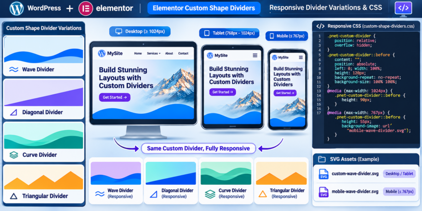
A custom divider that looks excellent on a desktop monitor may appear distorted or disproportionately large on a mobile device. Therefore, responsive styling is essential when implementing Elementor Custom Shape Dividers.
Although SVG graphics are inherently scalable, their displayed height, aspect ratio, and curve proportions still need to be considered. A divider with a height of 120 pixels may occupy too much space on a smaller screen.
5.1 Adjust divider height for different screen sizes
CSS media queries allow you to define different divider heights for desktops, tablets, and mobile devices. This keeps the transition proportional to the available screen space.
/* Desktop */
.pnet-custom-divider::before {
    height: 120px;
}

/* Tablet */
@media (max-width: 1024px) {
    .pnet-custom-divider::before {
        height: 90px;
    }
}

/* Mobile */
@media (max-width: 767px) {
    .pnet-custom-divider::before {
        height: 55px;
    }
}
These values are starting points rather than fixed requirements. Adjust them according to the actual SVG design and the height of the Elementor container.
5.2 Use different SVG graphics for mobile devices
Sometimes reducing the height is not enough. Complex wave patterns or geometric shapes may become visually crowded on narrow screens. In such cases, you can provide a simplified SVG specifically for mobile devices.
/* Default desktop divider */
.pnet-divider-bottom::before {
    background-image: url(
        "https://example.com/wp-content/uploads/custom-wave-divider.svg"
    );
}

/* Mobile-specific divider */
@media (max-width: 767px) {
    .pnet-divider-bottom::before {
        background-image: url(
            "https://example.com/wp-content/uploads/mobile-wave-divider.svg"
        );

        height: 55px;
    }
}
This approach gives you complete control over the visual appearance of the divider on smaller screens without changing the Elementor container structure.
5.3 Test different viewport sizes
After applying the responsive CSS, preview the page at desktop, tablet, and mobile breakpoints. Pay particular attention to the alignment between the SVG’s filled area and the background color of the adjacent section.
Also test the layout with longer headings, different content heights, and varying viewport widths. A decorative divider should enhance the layout without reducing readability or creating unnecessary horizontal scrolling.
Step 6: Enhance the Divider with Additional CSS Customization
Once the basic divider is working, you can extend its appearance using additional CSS properties. This is where Elementor Custom Shape Dividers become especially useful for developers who need more control than Elementor’s standard presets provide.
6.1 Control divider height and positioning
You can adjust the divider’s dimensions and positioning without editing the SVG file. For example, the following CSS moves the divider slightly outside the container boundary to create a more pronounced transition.
.pnet-divider-bottom::before {
    bottom: -1px;
    height: 140px;
}

.pnet-divider-top::before {
    top: -1px;
    height: 140px;
}
Small adjustments such as these can help eliminate visible gaps caused by subpixel rendering or rounding differences between adjacent sections.
6.2 Flip the divider horizontally or vertically
If you want to reuse one SVG design in multiple locations, CSS transformations can create alternative visual directions without maintaining separate graphic files.
/* Flip horizontally */
.pnet-divider-bottom::before {
    transform: scaleX(-1);
}

/* Flip vertically */
.pnet-divider-top::before {
    transform: scaleY(-1);
}
Use the appropriate transformation for your selected divider. Remember that transforming the pseudo-element can affect its visual alignment, so inspect the result on both desktop and mobile layouts.
6.3 Create multiple divider variations
You can assign different classes to different Elementor containers and define separate background images. This makes the implementation reusable across your entire website.
.pnet-divider-wave::before {
    background-image: url(
        "https://example.com/wp-content/uploads/wave-divider.svg"
    );
}

.pnet-divider-angle::before {
    background-image: url(
        "https://example.com/wp-content/uploads/angle-divider.svg"
    );
}

.pnet-divider-curve::before {
    background-image: url(
        "https://example.com/wp-content/uploads/curve-divider.svg"
    );
}
For these variations, assign the appropriate class alongside pnet-custom-divider and the directional class in Elementor. For example, a bottom wave would use pnet-custom-divider pnet-divider-bottom pnet-divider-wave.
Step 7: Load Custom Divider CSS Through a WordPress Child Theme
Adding CSS through the WordPress Customizer is convenient for a quick implementation. However, if you are building a production website or distributing custom functionality across multiple pages, loading the CSS through a child theme is a more maintainable approach.
WordPress provides the wp_enqueue_scripts action for loading frontend stylesheets and scripts. We can use this hook to load a dedicated stylesheet containing all our custom divider styles.
7.1 Create a custom stylesheet
Inside your active child theme directory, create a CSS file named custom-shape-dividers.css. Add the base styles, directional positioning, SVG background URLs, and responsive media queries from the previous steps.
7.2 Enqueue the stylesheet using PHP
Open the child theme’s functions.php file and add the following code. The function name uses the required pnet_ prefix to reduce the possibility of naming conflicts with other theme or plugin functions.
function pnet_enqueue_custom_shape_dividers() {

    wp_enqueue_style(
        'pnet-custom-shape-dividers',
        get_stylesheet_directory_uri() . '/custom-shape-dividers.css',
        array(),
        '1.0.0'
    );

}
add_action(
    'wp_enqueue_scripts',
    'pnet_enqueue_custom_shape_dividers'
);
This function loads the custom stylesheet on the frontend of your WordPress website. The get_stylesheet_directory_uri() function returns the active stylesheet directory URL, making it suitable for child theme assets.
The version number is useful for cache busting. Whenever you make significant changes to the stylesheet, you can increment the version so that browsers are more likely to retrieve the updated file.
7.3 Organize the implementation for maintainability
For a larger website, keep your custom divider assets organized in a dedicated folder inside the child theme. For example, you could use an assets/svg/ directory for the SVG files and reference those files using their public URLs in the stylesheet.
Avoid editing Elementor’s plugin files or its generated CSS files directly. Those files may be regenerated or overwritten during plugin updates, potentially removing your customizations.
You might also like:

Step 8: Test and Verify the Custom Shape Divider
After implementing the CSS and uploading the SVG, thoroughly test the result before publishing your changes. A divider may work correctly in the Elementor editor but behave differently on the actual frontend because of caching, theme styles, container positioning, or CSS optimization.
8.1 Preview the frontend
Open the page in a new browser tab and inspect the section containing your custom divider. Confirm that the SVG loads correctly, the divider is positioned on the intended edge, and the shape aligns with the background of the adjacent section.
8.2 Inspect the CSS in browser developer tools
Right-click the divider area and select Inspect to open your browser’s developer tools. Select the Elementor container and check whether the expected CSS classes are present.
Inspect the ::before pseudo-element and verify the following properties:
- The pseudo-element has a valid computed height and width.
- The background image URL points to the correct SVG file.
- The background image is not blocked or returning a 404 error.
- The parent container has the expected positioning context.
- The z-index does not place the divider above interactive content.
- No conflicting theme or Elementor CSS overrides the custom styles.
8.3 Clear caches after making changes
If you are using a caching plugin, CDN, or server-level caching, clear the relevant caches after updating your stylesheet or SVG file. Also use Elementor’s CSS regeneration option if the generated Elementor styles are outdated.
Test the page in a private browser window to ensure that you are viewing the latest version rather than a cached stylesheet or outdated SVG asset.
Common Errors When Adding Elementor Custom Shape Dividers
Even with a straightforward implementation, developers may encounter issues when adding custom SVG graphics to Elementor containers. The following are some common problems and their solutions.
1. SVG file cannot be uploaded to WordPress
Problem: WordPress displays an unsupported file type error when you try to upload an SVG graphic through the Media Library.
Solution: WordPress does not allow SVG uploads by default. Install and configure a maintained SVG upload solution that sanitizes files during upload. Verify the file’s security and validity before uploading it. Avoid enabling unrestricted uploads for all users.
2. Custom shape divider is not visible
Problem: The Elementor container has the correct CSS class, but the custom shape does not appear on the frontend.
Solution: Check the SVG background URL in your browser’s developer tools. Make sure the file exists and is publicly accessible. Verify that the pseudo-element has a non-zero height, that the container has a positioning context, and that the SVG itself contains a visible filled shape.
3. Divider overlaps text or buttons
Problem: The custom divider appears above headings, buttons, or other content inside the Elementor container.
Solution: Review the stacking context and z-index configuration. Use isolation: isolate on the parent and an appropriate stacking level for the pseudo-element. Alternatively, place content inside a dedicated wrapper with a higher stacking level.
4. Divider looks stretched or distorted
Problem: The wave or geometric pattern looks different from the original SVG design after being displayed across the full container width.
Solution: Check the SVG’s viewBox and preserveAspectRatio attributes. The background-size: 100% 100% property stretches the graphic to fill the available area. If the distortion is excessive, consider using background-size: 100% auto or a different SVG composition designed for the target dimensions.
5. Divider does not display correctly on mobile
Problem: The divider appears too large, too small, or visually unbalanced on mobile devices.
Solution: Add responsive media queries to adjust the divider height and background positioning. If the original graphic is too complex for a narrow viewport, create a separate mobile SVG and load it using a mobile-specific CSS media query.
6. Custom divider disappears behind the container background
Problem: The SVG is loading, but the divider is hidden behind the Elementor container background.
Solution: Review the pseudo-element’s z-index and stacking context. A negative z-index can place the pseudo-element behind other backgrounds depending on the DOM and stacking structure. Use browser developer tools to inspect the stacking order and adjust the parent and child layers accordingly.
7. Changes are not visible after updating CSS
Problem: You update the SVG URL or CSS dimensions, but the frontend continues displaying the old design.
Solution: Clear your WordPress caching plugin, CDN, and browser cache. Regenerate Elementor CSS if necessary. You can also update the stylesheet version in wp_enqueue_style() to trigger a fresh browser request.
Conclusion
Elementor’s built-in Shape Divider feature is useful for common section transitions, but its predefined designs may not satisfy every website’s visual requirements. By combining custom SVG graphics, Elementor CSS classes, and CSS pseudo-elements, you can create reusable and responsive Elementor Custom Shape Dividers without modifying Elementor’s core files or depending on additional page-builder extensions.
The implementation covered in this tutorial gives you control over SVG design, divider positioning, desktop and mobile responsiveness, and stylesheet organization. For production websites, keep your SVG assets sanitized, load your custom CSS through a child theme or maintained custom stylesheet, and test the final layout across different browsers and screen sizes.
With this approach, you can move beyond Elementor’s default divider presets and build distinctive section transitions that better match your website’s branding and overall design language.